Thursday, 6 July 2017

Last Survivors Movie poster

I decided to be creative with mine, and somewhat simplistic. At the top, I wrote a tagline to attract the audience to read about the film when they are brought to the gun and the title, which are both in bright colours in order to bring the eyes in, and to show both the comedy and horror elements, since blood features within the writing and off the bat, showing it is a generic zombie basher. The white backgroud serves the audience to look only at what's important, meaning that it is somewhat simplistic. I linked it to my magazine, and added other reviews to show the quality of the film, featuring many different important elements of movie posters, while staying within my drawing limits, and am somewhat happy with how it came out.

Stella! Double Page Spread


 This is the double page spread I chose to make. It uses the same colours, and fonts, and titles as the cover to link it, with page numbers to show it is part of a magazine and the two sides link, and pinks from the film to show what the film is, alongsidethe actual review which I laid out in a fairly simple way to read


Stella! Magazine Cover

This is the cover I decided on for my coursework. I based the Stella! title on a mixture of the famous scene in a streetcar named desire, and an adjective meaning outstanding. I took a screenshot from the film, based on covers in the past, and I believe it worked well


Thursday, 29 June 2017

Film Poster Analysis


I wanted my film poster to be more subtle, yet still take inspiration to drum up hype for the film, Hence I took inspiration from two vastly different film posters. Trainspotting was one, because it is vastly clever and incredibly well thought out to attract attention, and Teenage Mutant Ninja Turtles because it matches the subtly that I am going for with my film. Hence, I analysed both

Made with Padlet
Made with Padlet

Tuesday, 27 June 2017

Conventions of a film poster

Connotations

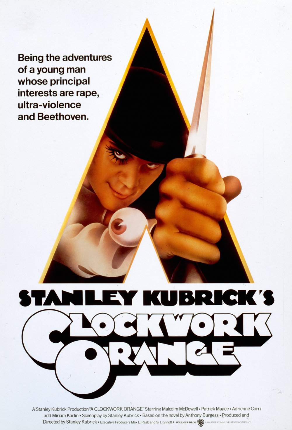
Image result for film postersAs well as the obvious meanings behind posters, posters very often imply some meanings, which the viewer needs to infer for themselves. For example, in this one, while there features a lot of denotations to show what type of film it will be, with the fact the Anchorage (the words that accompany what pictures are on the poster) mentions 'rape, ultra-violence and Beethoven' to show it won't be a normal film. The Tone and Register(Vocabulary, style and grammar used) however being something of a broken english show the type of man, through connotations. The fact he's holding a knife connotes danger, which combined with his face and the aforementioned writing show that this character is unhinged, meaning that this poster uses both connotation techniques and denotation techniques to sum the film up and attract the audience